Tuesday, February 9, 2016

Darling Press Opening Reception


I can't find the words to describe how elated I feel from Friday night's festivities! I'm endlessly grateful for all of my amazing friends who continue to show their love and support and to all of the new beautiful folks I met. Thank you all for being great and special thanks to Darling Press for being such incredible hosts!


If you were not able to attend, my solo show of typewriter drawings is still on view through February 28.  Check it out before this mini-month disappears:

Weekdays: 10am-6pm
Saturday: 11am-5pm
Sunday:   CLOSED

Also, the wonderful folks at DP host a cozy figure-drawing session EVERY TUESDAY night from 7-9pm for $8! They even have an adorable punch card, letterpressed of course. What a lovely drawing night to attend--plus a good excuse to see my work in the meantime. 

Sneak peek below:

Collection, 2016
 typewritten ink on paper, collaged
7.5 x 10 inches, $220
Sisters, 2016
typewritten ink on paper
11 x 14 inches, $300


Outline, 2016
typewritten ink on paper
7.5 x 10 inches, $220

Can't say it enough:
T H A N K   Y O U!

In Progress - Justin's Wife And Son


I'm having so much fun drawing these two.  I've said it before, the delicate features of children are so satisfying to capture--it's so easy to transform them into ghouls if you work them too much! This is such a sweet image to work from. This commission's due on Valentine's Day--I'm nearly finished.

Justin's Wife And Son, 2016, in progress, 8 x 10 inches

I would leave this negative space if it wasn't a commission--but at least it's something to consider for future pieces in my personal works. This one is on the minimal side, made using the following characters: # * %.  I might actually camouflage the few percentage symbols I've used to make it a strictly two-character drawing.  Why not? 


Thursday, February 4, 2016

Time-Lapse: Install at Darling Press


My install at Darling Press was a success! I'm getting faster at installing these large-scale grid works.


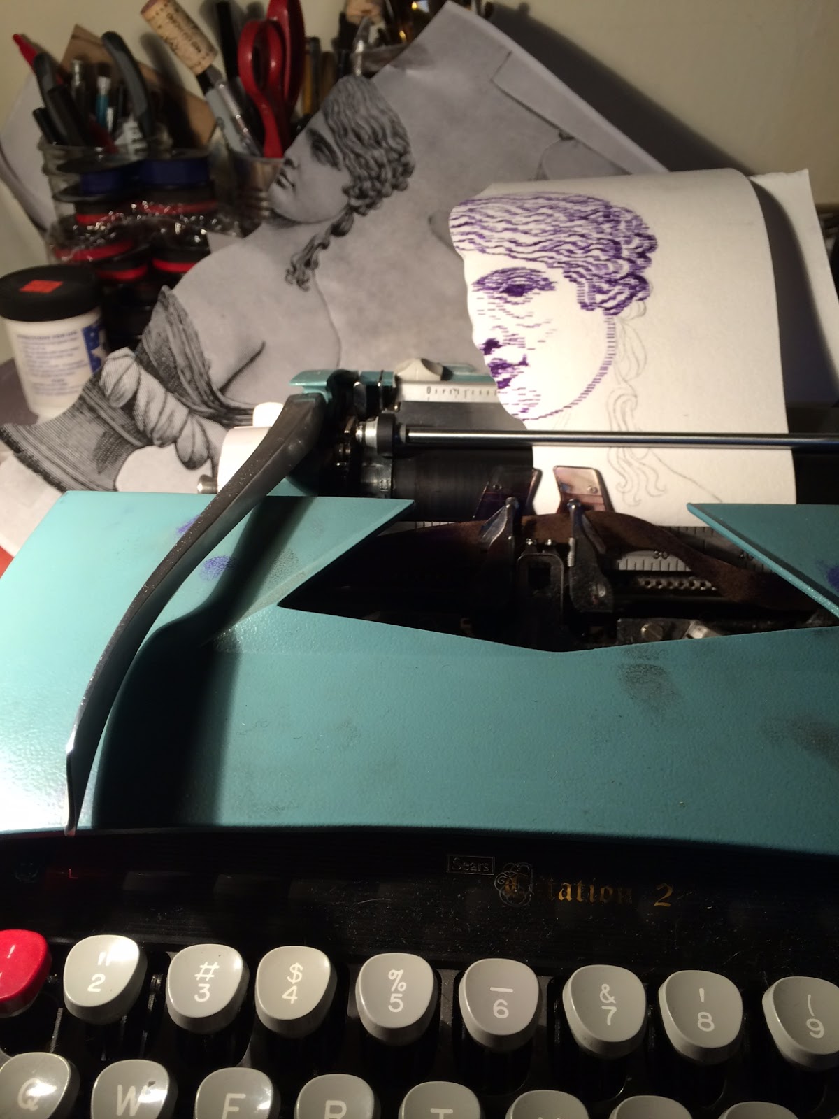
Give Up The Queen And Nobody Gets Hurt was completed in 2014 using only my Sears Citation II manual italic typewriter and 74 five-inch squares of paper.  It's displayed by placing thumbtacks in the wall and tiny magnets to attach the paper in place. 


I'm so thrilled to share this piece alongside my latest typewriter drawings as Artist of the Month at Darling Press in February!  If you are in Portland, please join us for the opening reception First Friday, February 5 from 7-10pm.  There will be wine and snacks as well as live music from the Miley Cyrus Mind Control Quartet! Hope to see you there!

Friday, January 29, 2016

Feeling Ultra Femme: Darling Press Opening Next Friday!

Hey Portland!

I'm so excited that I was finally able to get up to St. John's and snag the pink and green ribbons I've been raving about at Ace Typewriter.  Check out this delightfully femme carnation pink.  I want to make everything in bubblegum.


Outline, in-progress.  See it on view alongside typewriter drawings I've been creating since 2013 at Darling Press!


This is also a reminder that I have the honor of being the Artist Of The Month at Darling Press, an intimate space operated by kind and hardworking letterpress wizards, Robyn, Alia and Jason.  They are great.  Not only do they create amazing things, they curate a stunning selection of other finely crafted art and goods and host an awesome life-drawing session every Tuesday from 7pm-9pm.
Should you ever be in FoPo, go say hi.  They also have a disturbingly adorable dog named CousCous that camouflages with the floor and does three perfect tricks.

The opening reception is EXACTLY one week away--please feel free to RSVP on the Facebook Page.  The details once again:


Hope to see you there!

Friday, January 22, 2016

Artist Of The Month @ Darling Press


Please join us at the Darling Press Studio on first Friday, February 5th from 7-10pm--just two weeks away--to celebrate my latest typewriter drawings on view for the month. We can nerd out about beautiful old machinery while surrounded by it.

Stay tuned for more details on the Facebook invite page!

Hope to see you there!

Thursday, January 21, 2016

In Progress - Sisters

Sisters will be featured in my show of typewriter-drawings at the Darling Press Studio this February.

Portlanders, please join us for the opening reception on First Friday, February 5 from 7pm-10pm--we'll have wine, snacks, and the Miley Cyrus Mind Control Quartet (the most delightfully un-google-able band) will be performing.  

Hope to see you there!


Saturday, January 16, 2016

Commission: Drawings Of Beautiful Women

I'm so delighted that beautiful women keep asking me to draw them.  Now that these gifts have been given, it's alright for me to share them completely.
Emily, 2015
typewritten ink on paper, 8 x 13 inches

I owe my sweet cosmic mom, former boss and friend, Cameryne for connecting me with Emily. Thanks to Cam, who purchased one of my drawings from my show in my hometown, Milwaukee, last June as well as commissioned another drawing for her friend's birthday, I now have two drawings that live in Glasgow.
Reeah, 2015
typewritten ink on paper, 8 x 8 inches
Hair is so much fun to draw with my typewriter.  I was overzealous on the first version of this drawing and attempted to make the portrait only 4 x 4 inches, but Reeah's delicate profile proved to be difficult to render on that small of a scale.  I started over halfway through,  which made the hair a much more challenging and interesting point of focus.

Thanks, lovely ladies.

Wednesday, January 13, 2016

Commission: The Tightrope Walker

At the end of 2015, I had the honor of making a typewriter-drawing for my very first collector in Portland.  In 2009, Michael bought an etching of mine from a group show at Backspace (RIP)--my first show in town--alongside Troy Briggs, Adam Stacey and Anthony Hix. That was probably one of the last prints I pulled from the MIAD print shop.  I covet and romanticize this space and can recreate the sensual-landscape of wonderfully toxic odors, each differing from the litho-, to the -intaglio to the -screen room. Let's gaze listlessly out of a window.

The Tightrope Walker, 2015
8 x 14 inches, typewritten ink on paper
The Tightrope Walker was a fun challenge--working smaller than ever before, figure-wise.  The tightrope walker herself is only 4.5 inches tall.  It was exciting and delightfully nerve-wracking to force myself to work in an impressionist way--each mark a gamble. I am grateful for having abandoned my purist tendencies with typewriter-drawing awhile back, and employed an eraser.  Everything is a drawing tool.

It was fabulous to make a piece for such an imaginative person--we had a long back-and-forth of planning for the feeling and look of the piece.  It was originally going to be a thoughtful gift for his wife, but Michael admitted when we exchanged that it became mainly for himself... Self-gifts are important.

There was another contrast between this piece and the work I make for myself.  I am a coward with words and have never considered incorporating text in my own work. I realize this may sound counterintuitive or wasteful (I'm using a typewriter all wrong!), but I really just enjoy using the typewriter as a straightforward drawing tool--using apostrophes and asterisks for fine lines and percentages and pounds for shading or to make velvet black, without incorporating subtext.  Plus, there are people like Leslie Nichols using the same tool to create incredible things utilizing text and meaning and order in such an overwhelmingly beautiful way.  Yes, a hero of mine. Michael had asked me to incorporate a quote from Ernest Becker's book The Denial Of Death, as a secret message, not necessarily detectable, "like a little hidden Easter egg for [himself]". What a lovely project. Thanks Michael!


Monday, January 11, 2016

In A Dream: Walgreen's Version Of Beetlejuice

I don't normally write. Nor do I post non-visual things here.  However, now that I've finally replaced my laptop, I can capture my dreams fresh and lazily while my eyes are still closed and I lie in bed. Yes, we all hate hearing about people's dreams--but read it anyway:

The scene is first person, myself watching “Beetlejuice” at the bar of Gladstone Street Pizza, where there is no TV in real life. The movie is just beginning, which then becomes fullscreen:

A male narrator's voice is heard over an aerial pan of a suburban neighborhood, a diagonal view of one small wooden house and one larger brick one.  They are both one-story, but the larger one hovers over two garages. The narrator explains that his family had swapped houses with the neighbors since they kept having kids. He hinted at a subtle point of contention regarding the confusion caused by the neighbors' last-born pair of kids being given the same first names as he and his sister.

It then pans to the mom and dad emerging from their champagne colored luxury vehicle, with a ramp coming out and everyone parading out of the vehicle after them. The narrator describes each one, first the human children who are descriptionless and inconsequential, but are quickly followed by the important brand of hypoallergenic dog. She comes out on a motorized skateboard and has breast implants. They are furry modest breasts. There’s a second dog, more of a terrier, also on a motorized board and had “the best calves on a dog despite its inability to walk” according to the narrator.  Apparently he had implants, too.

Then we see a clip of the human family on an unidentifiable game-show. The narrator describes boring characteristics of his neighbors, but I am absently watching the movie, so I can’t remember what he says about them.  They are in front of a velvet cornflower-crayon colored curtain, posing and attempting to do a classic nineties “jump up and have the camera freeze on a shot of everyone in the air and looking great” but it fails fabulously and they are mid-smile and squatting instead.  Mom looks the most awkward, but is the only person with any remarkable features, resembling Sarah Silverman.

There is suddenly a flash of another scene from the middle of the movie. Lidia (a Walgreen's version, not Winona Ryder) is in a dark kitchen, trying to avoid dancing at a party of ghouls.  She’s cornered by a looming male figure: a smelly, overbearing angel. In this world, angels are filled with straw.  The angel doesn’t resemble the archetype—it looks like Lux Interior in an ill-fitting tuxedo.  Our heroine finally gets annoyed by his odor and unremarkable dancing and, squinting, pulls handfuls of straw out of the Lux-alike's abdomen.  A second angel, also very unlike the archetype, is roughly two feet tall, can float and is wearing what would annoy you if you saw someone in public dressed up as a circus performer for no good reason. He solemnly snatches pathetically small piles of straw in trips, floating in the style of a bumble-bee to stuff back into the Lux-alike who is lying dramatically on his back like Goya etched him.  The floating angel shakes his head disapprovingly at Lidia without looking at her directly and mutters in a tiny voice “so naughty, so naughty” as he takes endless trips stuffing his friend.


Before I forget, it then returns to first-person.  A guy at the bar leans over to explain to me why the family’s failed freeze frame is funny.

Wednesday, January 6, 2016

So Long, Chromaphobia

I've spent nearly a decade with an aversion to using color. This stemmed from my initial love for etching and aquatint--what's the point of introducing color when you can play endlessly with undulating values?!--as well as a fear and lack of understanding color itself and how to use it.

I've discussed my fear of painting with many friends. The biggest drawback to me is that there are too many variables (brushes, marks, materials, translucency, etc) and then on top of it, color and all of its endless avenues.  As my friend Keegan pointed out, I enjoy being able to make a mistake--hence using the typewriter, etching an image in steel, or using permanent marker and rubbing alcohol to make a drawing. I enjoy using tools which provide some kind of limitation. Light masochism? Cowardice?

Anyway, for the last few months, while actively in a frenzy of high contrast black and white portraiture, I have spent a lot of time passively staring at, thinking about, and appreciating color, as a voyeur. I contemplate the subtle yet overwhelming effects of light on a beige wall alongside the dazzling appearance of vivid colors in nature, ordinary human-made objects, photography, and painting. I have spent a lot of time building imaginary palettes, wondering how things were created, considering the changes in house exteriors I see on my daily routes while illuminating light upon surfaces paired with the sky in the background alters the same view so drastically.

Precious Cargo, in progress
typewritten blue and red ink on Rives BFK

Now that I have finally shrugged off the fear of using color, I'm taking steps to using it directly--and it is mind-bendingly exciting.  Even just pairing two colors--knowing that blue and red make purple because I'm a 30 year old person with rods and cones--is a thrill to watch, and maybe more so because I'm watching it change as it moves through the typewriter.

I'm super excited to use this decade to further consider and actively use color.  I remember an instance pointing to my color-use-paralysis in litho class my sophomore year of college, with Lynn Tomaszewski.  We were doing two- to three-plate printing, and while my other classmates were playing with the overlap of various colors and values and how that affected different areas of an image, I was resigned to using an fiery red, shapes of color without texture or changes in value under a black plate which held all of the outlining visual information. The same went for my color work in screen-printing and intaglio, too. I am still working through this--in Dominic In Blue, it's hardly an exercise in color use, but it's a fun monochromatic study--a focus on using different tools (I used only "/" for the flesh).  And I just drool over that cerulean ribbon!

Dominic In Blue, 2016
typewritten blue ink on Rives BFK
8 x 10 inches

I am looking forward to escaping this paralysis, this rigid thinking I have with color.  The typewriter, since it naturally provides limitations (in mark-making, width allowance, material), is actually helpful in allowing me to hand myself over to color.  By providing these limitations, it allows me to be more flexible and carefree within the realm of color.  While color choice is still limited--there aren't endless ribbon colors like there are tubes of paint, but as we all know from living in a world covered in CMYK-printed things, I still have a pretty free range. Plus I recently learned that Ace Typewriter has pink and green ribbons in addition to the blue and purple that I've already added to my chromatic collection!

This rigidity is still present in my first attempt at creating a four-color CMYK typewriter-drawing.  I separated the layers of a color photograph in Photoshop and had each layer printed so that I could copy the predetermined colors exactly.  Being that I haven't yet located a yellow ribbon, I have substituted the use of Saral yellow transfer paper secured to the Rives BFK and running it through with the photocopy secured on top and typing over all three layers, doing the Y-layer blind, so to speak.

Self Portrait, in-progress 4-color typewritten ink and 

I plan to continue working in a way using the CMYK process, but instead of relying on the predetermined layers given to me, trying to use my own brain to imagine how hard/soft or dense/loose to apply each layer.  Though I bought this book years ago, I'm currently reading Island of The Colorblind by one of my favorite authors, self-proclaimed neuro-anthropologist Oliver Sacks (RIP). I recognize my privilege in being able to see and appreciate color.  In the book, he discusses his friend and colleague, Knut, an achromatope, "who has never seen color...has experienced only the positivity of vision, and has built up a world of beauty and order and meaning on the basis of what he has." I am excited to navigate this new personal appreciation and bask in the magic of color.  Now go read the book.

Top-Heavy, 2016
collaged typewritten purple and red ink on paper
10 x 13 inches


The last thing--I look forward immensely to exhibiting my latest typewriter-drawings (some in color) at my upcoming shows this February: first a solo exhibition at Darling Press (endless gratitude to Nele and Jen for connecting us and making this show happen!) and several pieces will be featured in a drawing show curated by Robert Tomlinson at the Western Oregon University. More details to come...stay tuned!


Sunday, December 13, 2015

The End Of A Fabulously Busy Year

I am thrilled, relieved, grateful, inspired, and overjoyed--this year has been exceedingly full and exciting in so many ways and it looks like this year is primed to unfold in kind.

I have not updated this baby in awhile because I've been blissfully nestled in a seemingly endless array of deadlines, from holiday gift typewriter-drawing commissions, to web illustrations and too many crochet projects--fortunately for my blog, my wrists are now protesting my use of them, forcing me to take a hiatus from drawing.

I keep getting asked to draw beautiful women--yes, please! Will release full image after Christmas presents are received...


So in the meantime I'll torture myself with these images of projects I can't wait to finish or begin:

I would totally date a grid.


Here's a snap of some freshly scored Rives BFK that I can't wait to dig into. This is intended for my upcoming show at Café Lulu in my hometown Milwaukee, Wisconsin, in April 2016. I've got a huge space to fill and plan to make twelve to fifteen 30 x 44" drawings for this show--at this point mainly using permanent marker and other usual suspects of drawing materials.


* * *
Purple ribbons available at Ace Typewriter in St. John's!


A recovering chromaphobe's in-progress self portrait.
I cannot believe I am finally basking in the magic that is working in color! The idea of creating a four-color CMYK typewriter-drawing was floating around in my head for awhile, but the problem stopping me was locating a yellow ribbon. Thanks to Ace Typewriter I have blue, purple, and standard black and red, but it appears that yellow may not exist--if anyone has leads, let me know! Luckily, my brilliant friend Jessica Poor suggested using Saral yellow transfer paper:

Photocopy of separated yellow layer on top of yellow transfer pape fastened to quality paper allowing the typewriter to transfer marks indirectly.

That pretty blue ribbon--it looks ultramarine but types a stunning cerulean. Tiny view before the cyan layer is added to the completed magenta (well, red) and yellow layer.


 This is why I refer to myself as a closet-printmaker. All of my drawings are attempts to make drawings that look or act like prints. Is typewriter drawing just a masochist's monotype?

* * *

In more leisurely news, I've had the immense pleasure of discovering the Portland Correspondence Coop held every third Tuesday at the IPRC--it's a wonderful community of awesome creative people who meet and make mail art, often involving some kind of mail art exchange with a monthly theme, jovial conversation and a rotating cast of typewriters brought in to test-drive by expert/enthusiast Ethan Jewett of PDX Typewriters. Its free, open to the public and highly recommended--stay tuned via instagram, too!

The PDXCC has reminded me about how great mail art and old fashioned correspondence is in general--I mean, I use a manual typewriter to draw, I should be using it the right way, too.

In my early twenties, I had a solid penpal situation with my dear pal Emily--of which the peak of correspondence took place when we lived on the same street (and still used USPS!)--as well as romantically bombarding potential suitors and my friend Michael, who I met in Milwaukee but was instrumental in and an unforgettable help when I moved to Portland.

Klaus Nomi Elvis stamp

Drawing frivolous things--a forgotten pleasure


Reverse side of a wedding gift waiting to be sent. Color!


Anyway, I'm really excited to have begun a mail-art back-and-forth with Brendan Larsen, one of my favorite drawers I've found on Instagram. Also, I look forward to rekindling the practice of sending unexpected appreciative mail to loved ones as well as some good old typewritten-letter correspondence with Colin Smith and future fun drawing collabo with the talented Quinn Amacher. Anyone else?

* * *

Lastly, I'm excited to announce that my typewriter-drawing, Carissa, is featured in the winter issue of PictureSentence and that the creators of the publication, Robert and Margaret Tomlinson, have invited me to share some of my work in a drawing show Robert is curating at the Western College of Oregon in February 2016.

Also in February, I look forward to a joint exhibition with the incredibly talented Stephanie Yoo* at Darling Press! Brooklyn transplants, she and her loverman Hunter have been super supportive in sharing my work with others and attending my shows (and letting me draw them!). I wouldn't have met them if it wasn't for my amazing cousin and prolific musician Lorna--who now also, along with her wonderful partner Keith, share this beautiful city with us. I'm so spoiled.

That said, I want to express my gratitude for the unending ways my pals and colleagues have offered their undeniable emotional, logistical, creative, brilliant, kind-hearted, and continuous support. Thanks so much for attending my many shows and events this year, and I can't wait to share the details of 2016's already mounting list of shows! Looking forward to the future! XO

*CORRECTION: The show at Darling Press will be a solo show after all, but Stephanie Yoo and I will have a joint show sometime later this year. 

Thursday, October 29, 2015

Mostly Drawings Of Women: Opening Reception First Thursday


It's exactly one week away from the reception for my final solo show of the year--I'm excited, relieved, and super pumped to hide in the studio to prepare for the upcoming shows next year. 


Until then, I'm very glad to install Give Up The Queen And Nobody Gets Hurt once again--I just need to make sure I have 296 magnets and thumbtacks. I'm also happy to see all of my typewriter drawings behind glass--I'm a poor gift-wrapper, so I won't see most of them until I install at the salon this Monday. 


This reception delightfully coincides with 77 Salon's brand re-launch party, so it'll be quite the celebration.  It's rumored there will be pizza and bubbly. Hope to see you there!


Mostly Drawings Of Women
ink and typewriter drawings by Rachel Mulder
77 Salon
1100 NW Glisan Street
Portland, OR 97209

First Thursday, November 5
7-9pm

On view Nov. 2 - 29
M-F: 10am-8pm
Sat: 9am-6pm
Sun: closed

Wednesday, October 14, 2015

Mostly Drawings Of Women - Solo Exhibition at 77 Salon


I'm so pleased to announce that my final exhibition of this year will showcase the various media I've been working with since 2014.


Please celebrate the closure of this beautifully wild year with me on First Thursday, November 5 from 7-9pm! You can RSVP and stay tuned for more details on Facebook.

Mostly Drawings Of Women
on view November 2 - 29

77 Salon
1100 NW Glisan Street
Portland, OR 97209

Opening Reception
First Thursday
November 5
7-9pm


Additional hours:
M-F 10am-8pm
SAT 9am-6pm
SUN closed

Streetside At Blackfish

First Thursday Shot, by Keith Milgaten
Stephanie And Hunter, 2015
typewritten ink on paper, 28 x 34 inches
I'm so excited to focus on wrapping up my projects for what has been a delightfully wild and productive year.  I'm currently working on a bunch of holiday-deadline commissions and wrapping up all my loose ends for my final show in November--details coming soon.  In the meantime, check out my latest typewriter drawing on view at Blackfish Gallery in The Pearl District.  You can see it at any time of day, so go at midnight. Stephanie And Hunter will be on view through October 31.

Thursday, October 8, 2015

Jill - Work In Progress

This is a commission I've just begun for my amazing cosmic-mom, Cameryne.  It's her dear friend, Jill, as a kid and will be a present for her for her birthday.


Kid's are so challenging to draw because it's so easy to make them look ghoulish! Perfect for October. I've got a ways to go, but I'm so excited about the upcoming details on the shirt and to dabble with the receding background.

Monday, October 5, 2015

October Is Typewriter Month!

And I had no idea--this is what being productive in the studio for six consecutive shows leads to: being totally out of touch with what's happening outside of yourself.

Patsy, 2015
 typewritten ink on paper, 6 5/8 x 13 3/8 inches
SOLD


I'm super grateful to Nico Courtelis and Chloe Eudaly (proprietress of Reading Frenzy and co-founder of the IPRC) were kind enough to clue me in to the excitement that is Typewriter Month in our fair city. All the hubbub is co-sponsored by IPRC and Design Week Portland with typewriter aficionado and publisher/editor/designer of Uppercase Magazine Janine Vangool gracing us with her presence with a release and presentation of her new book, The Typewriter: A Graphic History Of The Beloved Machine.  She has all the details/itinerary here.

I unfortunately* won't be available to attend this year's soiree, but it's on my calendar for next year. Should you be available, please attend and tell me all about it and/or let me live vicariously through your Instagram.

If you are feeling especially generous, you can feel free to tell people to go to Blackfish Gallery to see my latest typewriter drawing AND to Radish Underground to see my very first humongous monster of a typewriter drawing--both on view currently!

In other news, I finally scanned the pieces I had on view at Luke's Frame Shop last month--enjoy! Endless thanks to everyone who came out to both recent openings--what a blast!

Erica, 2015
typewritten ink on paper, 8 x 9 1/4 inches
 $200

Kierre, 2015
 typewritten ink on paper, 16 1/4 x 11 1/2 inches
$250


Self Portrait II, 2015
typewritten ink on paper, 7 x 12 inches
SOLD

Thom, 2015
typewritten ink on paper, 14 5/8 inches x 9 15/16 inches  
$250
*It's actually quite fortunate because I get to watch two people I love and adore, Robbie and Katharine, marry each other!