Showing posts with label color. Show all posts

Friday, May 27, 2016

In Progress - Brönwyn & Avery

Cranking out some new work for my show at Bare Bones Cafe, on view this June.

I've said it before, but now that I've got to draw a child for the third time, it's really fun and challenging to work around making a kid look like a monster.  However, I owe my gratitude to Jenny and Jason for sending me a photo of their sweet spawn with an already ridiculous expression, granting me license to make this super goofy drawing:


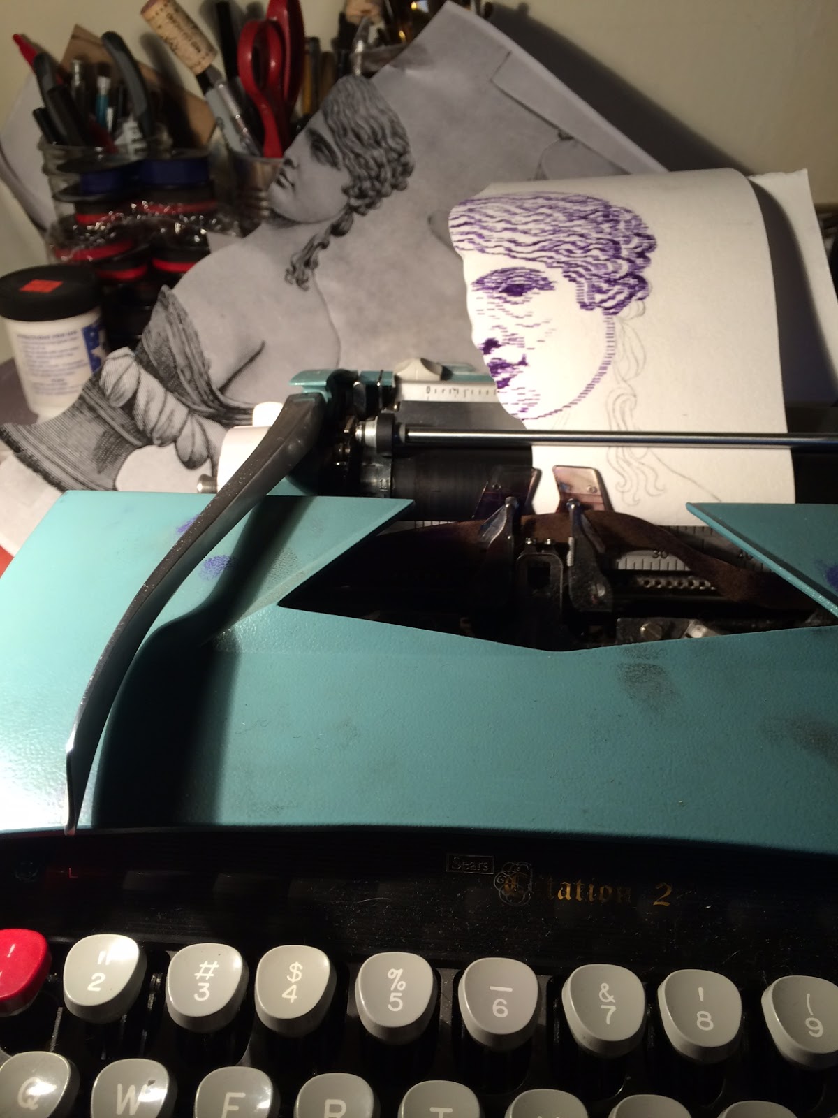
I also have the privilege of borrowing the face of this lovely drawer of grotesque and unabashedly gooey creatures, Brönwyn Lorelei, using my pink ribbon from Ace Typewriter paired with typed-on yellow transfer paper.


Mark your calendars for the reception--a week from today!

Opening Reception
Typewriter Drawings & More
Friday, June 3rd, 6 - 9pm
Bare Bones Cafe
2908 SE Belmont Street

Free event + refreshments available for purchase
Songs slung by DJs Lorna Dune + Keith Sweaty

*Reminder that 30% of my art sales will be donated to my favorite nonprofit Public Annex*


Thursday, February 25, 2016

People Become Stories When They Die

work in progress: Who Were You, Who You Were 30 x 31.5 inches, archival stamp ink on paper

Two years ago I'd asked my dad if he could send me a few photo albums all the way from Wisconsin. I requested one album in particular which had an achromatic photo of my mom's sisters in creepy halloween masks which was probably taken in the late 50's or early 60's.  My dad searched through endless photo albums and, distracted by the halloween request, instead sent me a few from my brother's childhood--which for the record included an amazing picture of my brother and his friends dressed as a gorilla, a Smurf, and Garfield--the latter two the kind with a hard plastic mask and shiny plastic bag for the costume.  I laughed and scoffed (like a crappy teenager) at our game-of-telephone, but thought there might be something special in the mix-up.

I'm a sucker for the color ochre. All of my brother's childhood photos have a lovely patina of gold or sea green.  Although we are nine years apart, there were a lot of overlaps in the things we did for fun since we grew up in the same tiny town, and looking through these photos made me smell and hear and taste all the things I remembered from my own.  It mostly smells like grass and dirt and sun. Do you remember how your knees smelled when you were a kid?

Several of these photos were used as inspiration in 2014 in my series Your Shadow's Shadow. They feature my brother (who's very much alive and expecting a babe with my lovely sis-in-law) and our mom who died of cancer in 2010. They were so young and so alive in the photos. Both have the sweetest teeth-concealing smiles. Mischievous.  It's so strange now, nearly six years later trying to re-materialize this woman. Who was she? Every relived memory I have of her degrades itself and disappears each time I recall--my new memory superimposing itself on the original, like the cancer that took over her brain and body. On top of this, there are so many missing stories.  Who this person was before she had us kids, who she was when she was a kid herself, how did she personally navigate the gossip and smallness of Waubeka, Wisconsin?

I have vague ideas of the answers to these questions.  She raised me, after all.  I have so many traits and behaviors that I can see translating directly from her in myself.  From the stories I remember, I can imagine how she felt after the nuns made her drink spoiled milk, and what she did when she discovered my brother's bio-dad was cheating on her, the cute story of how she and our dad met through their mutual mechanic, or how she'd go dancing at Wyler's on Saturday nights with her girlfriends.  But for us, naturally self-centered kids, she had to emit such a gleaming, endlessly caring M-O-M; we can only wonder what these experiences were to her.  These thoughts and actions simmering in her quiet, secret strength behind her kind and meek exterior. This woman who made us butter-heavy meals, had laugh-attacks with us, and dozed off on the couch while we played with her hair even though she woke up at 3am to build engines in a factory.

I reopened these albums again this year.  This latest grid-based series is based on family photos, allowing me to excavate these wonderings in a superficial way, I suppose.  I found a few of mom and I in my brother's album--I'm guessing this (above) is from 1989. I say superficial because I'm not going to find the answers to these questions here, but it's been interesting and reflective for me to re-draw photos from my own family.  Maybe I'm a shit-head, but I always thought our family photos looked boring. They were recognizable, things I experienced in real life. When I go to Smut and flip through their suitcase of Instant Relatives, even the mundane looks exciting because I've never seen it before. 

This drawing is allowing me to illuminate the mundane. Now that I don't have access to knowing our mom in real life, it's no longer mundane because people become stories when they die. 


I began by scoring a grid into the paper using my etching needle. Using quarter-inch diamond stamps (hand carved from a polymer eraser--thanks to the lovely JJ from PDXCC for the tip!) as my only tools and four colors (CMYK) of archival stamp ink, I slowly and methodically tiptoe from the bottom to the top. Everything about this process is like a last-ditch effort to be a printmaker, but not.

It's been so fun to navigate through the color and to carefully try to make the most out of as few marks as possible.  I can't go backwards once the stamp is down, just like with the typewriter.  I like having the opportunity to make irrevocable mistakes, which is probably what led me to printmaking in the first place.

But am I painting?  I'm stubbornly labeling myself as a printmaker/drawer; plus the methods I'm using are a departure from my typewriter drawings, so I really don't think so. It could be a monotype. It's definitely a drawing.  I feel like it can't be a painting because painting is loose, and you can paint over it, and you can use an endless variety of tools--but there are endless ways to make prints and draw and maybe my lack of painting-knowledge is making me pigeon-hole what painting is. Hm.

In any case, I am super thrilled to be near completion with the first piece for my upcoming solo show: Who Were You, Who You Were on view at Café Lulu, in Milwaukee, Wisconsin, from April 15 - May 31, 2016.  The opening reception will be held in conjunction with Bayview Gallery Night on Friday, April 15 from 5 - 9pm.  So excited to share this work, in particular, back home.

Postcard (coming soon!) for my upcoming solo show.

If anyone would like a postcard sent to them, please email me your mailing address: redlumlehcar@gmail.com


Detail shots below.  Have a beautiful day.


Friday, January 22, 2016

Artist Of The Month @ Darling Press


Please join us at the Darling Press Studio on first Friday, February 5th from 7-10pm--just two weeks away--to celebrate my latest typewriter drawings on view for the month. We can nerd out about beautiful old machinery while surrounded by it.

Stay tuned for more details on the Facebook invite page!

Hope to see you there!

Wednesday, January 6, 2016

So Long, Chromaphobia

I've spent nearly a decade with an aversion to using color. This stemmed from my initial love for etching and aquatint--what's the point of introducing color when you can play endlessly with undulating values?!--as well as a fear and lack of understanding color itself and how to use it.

I've discussed my fear of painting with many friends. The biggest drawback to me is that there are too many variables (brushes, marks, materials, translucency, etc) and then on top of it, color and all of its endless avenues.  As my friend Keegan pointed out, I enjoy being able to make a mistake--hence using the typewriter, etching an image in steel, or using permanent marker and rubbing alcohol to make a drawing. I enjoy using tools which provide some kind of limitation. Light masochism? Cowardice?

Anyway, for the last few months, while actively in a frenzy of high contrast black and white portraiture, I have spent a lot of time passively staring at, thinking about, and appreciating color, as a voyeur. I contemplate the subtle yet overwhelming effects of light on a beige wall alongside the dazzling appearance of vivid colors in nature, ordinary human-made objects, photography, and painting. I have spent a lot of time building imaginary palettes, wondering how things were created, considering the changes in house exteriors I see on my daily routes while illuminating light upon surfaces paired with the sky in the background alters the same view so drastically.

Precious Cargo, in progress
typewritten blue and red ink on Rives BFK

Now that I have finally shrugged off the fear of using color, I'm taking steps to using it directly--and it is mind-bendingly exciting.  Even just pairing two colors--knowing that blue and red make purple because I'm a 30 year old person with rods and cones--is a thrill to watch, and maybe more so because I'm watching it change as it moves through the typewriter.

I'm super excited to use this decade to further consider and actively use color.  I remember an instance pointing to my color-use-paralysis in litho class my sophomore year of college, with Lynn Tomaszewski.  We were doing two- to three-plate printing, and while my other classmates were playing with the overlap of various colors and values and how that affected different areas of an image, I was resigned to using an fiery red, shapes of color without texture or changes in value under a black plate which held all of the outlining visual information. The same went for my color work in screen-printing and intaglio, too. I am still working through this--in Dominic In Blue, it's hardly an exercise in color use, but it's a fun monochromatic study--a focus on using different tools (I used only "/" for the flesh).  And I just drool over that cerulean ribbon!

Dominic In Blue, 2016
typewritten blue ink on Rives BFK
8 x 10 inches

I am looking forward to escaping this paralysis, this rigid thinking I have with color.  The typewriter, since it naturally provides limitations (in mark-making, width allowance, material), is actually helpful in allowing me to hand myself over to color.  By providing these limitations, it allows me to be more flexible and carefree within the realm of color.  While color choice is still limited--there aren't endless ribbon colors like there are tubes of paint, but as we all know from living in a world covered in CMYK-printed things, I still have a pretty free range. Plus I recently learned that Ace Typewriter has pink and green ribbons in addition to the blue and purple that I've already added to my chromatic collection!

This rigidity is still present in my first attempt at creating a four-color CMYK typewriter-drawing.  I separated the layers of a color photograph in Photoshop and had each layer printed so that I could copy the predetermined colors exactly.  Being that I haven't yet located a yellow ribbon, I have substituted the use of Saral yellow transfer paper secured to the Rives BFK and running it through with the photocopy secured on top and typing over all three layers, doing the Y-layer blind, so to speak.

Self Portrait, in-progress 4-color typewritten ink and 

I plan to continue working in a way using the CMYK process, but instead of relying on the predetermined layers given to me, trying to use my own brain to imagine how hard/soft or dense/loose to apply each layer.  Though I bought this book years ago, I'm currently reading Island of The Colorblind by one of my favorite authors, self-proclaimed neuro-anthropologist Oliver Sacks (RIP). I recognize my privilege in being able to see and appreciate color.  In the book, he discusses his friend and colleague, Knut, an achromatope, "who has never seen color...has experienced only the positivity of vision, and has built up a world of beauty and order and meaning on the basis of what he has." I am excited to navigate this new personal appreciation and bask in the magic of color.  Now go read the book.

Top-Heavy, 2016
collaged typewritten purple and red ink on paper
10 x 13 inches


The last thing--I look forward immensely to exhibiting my latest typewriter-drawings (some in color) at my upcoming shows this February: first a solo exhibition at Darling Press (endless gratitude to Nele and Jen for connecting us and making this show happen!) and several pieces will be featured in a drawing show curated by Robert Tomlinson at the Western Oregon University. More details to come...stay tuned!


Sunday, December 13, 2015

The End Of A Fabulously Busy Year

I am thrilled, relieved, grateful, inspired, and overjoyed--this year has been exceedingly full and exciting in so many ways and it looks like this year is primed to unfold in kind.

I have not updated this baby in awhile because I've been blissfully nestled in a seemingly endless array of deadlines, from holiday gift typewriter-drawing commissions, to web illustrations and too many crochet projects--fortunately for my blog, my wrists are now protesting my use of them, forcing me to take a hiatus from drawing.

I keep getting asked to draw beautiful women--yes, please! Will release full image after Christmas presents are received...


So in the meantime I'll torture myself with these images of projects I can't wait to finish or begin:

I would totally date a grid.


Here's a snap of some freshly scored Rives BFK that I can't wait to dig into. This is intended for my upcoming show at Café Lulu in my hometown Milwaukee, Wisconsin, in April 2016. I've got a huge space to fill and plan to make twelve to fifteen 30 x 44" drawings for this show--at this point mainly using permanent marker and other usual suspects of drawing materials.


* * *
Purple ribbons available at Ace Typewriter in St. John's!


A recovering chromaphobe's in-progress self portrait.
I cannot believe I am finally basking in the magic that is working in color! The idea of creating a four-color CMYK typewriter-drawing was floating around in my head for awhile, but the problem stopping me was locating a yellow ribbon. Thanks to Ace Typewriter I have blue, purple, and standard black and red, but it appears that yellow may not exist--if anyone has leads, let me know! Luckily, my brilliant friend Jessica Poor suggested using Saral yellow transfer paper:

Photocopy of separated yellow layer on top of yellow transfer pape fastened to quality paper allowing the typewriter to transfer marks indirectly.

That pretty blue ribbon--it looks ultramarine but types a stunning cerulean. Tiny view before the cyan layer is added to the completed magenta (well, red) and yellow layer.


 This is why I refer to myself as a closet-printmaker. All of my drawings are attempts to make drawings that look or act like prints. Is typewriter drawing just a masochist's monotype?

* * *

In more leisurely news, I've had the immense pleasure of discovering the Portland Correspondence Coop held every third Tuesday at the IPRC--it's a wonderful community of awesome creative people who meet and make mail art, often involving some kind of mail art exchange with a monthly theme, jovial conversation and a rotating cast of typewriters brought in to test-drive by expert/enthusiast Ethan Jewett of PDX Typewriters. Its free, open to the public and highly recommended--stay tuned via instagram, too!

The PDXCC has reminded me about how great mail art and old fashioned correspondence is in general--I mean, I use a manual typewriter to draw, I should be using it the right way, too.

In my early twenties, I had a solid penpal situation with my dear pal Emily--of which the peak of correspondence took place when we lived on the same street (and still used USPS!)--as well as romantically bombarding potential suitors and my friend Michael, who I met in Milwaukee but was instrumental in and an unforgettable help when I moved to Portland.

Klaus Nomi Elvis stamp

Drawing frivolous things--a forgotten pleasure


Reverse side of a wedding gift waiting to be sent. Color!


Anyway, I'm really excited to have begun a mail-art back-and-forth with Brendan Larsen, one of my favorite drawers I've found on Instagram. Also, I look forward to rekindling the practice of sending unexpected appreciative mail to loved ones as well as some good old typewritten-letter correspondence with Colin Smith and future fun drawing collabo with the talented Quinn Amacher. Anyone else?

* * *

Lastly, I'm excited to announce that my typewriter-drawing, Carissa, is featured in the winter issue of PictureSentence and that the creators of the publication, Robert and Margaret Tomlinson, have invited me to share some of my work in a drawing show Robert is curating at the Western College of Oregon in February 2016.

Also in February, I look forward to a joint exhibition with the incredibly talented Stephanie Yoo* at Darling Press! Brooklyn transplants, she and her loverman Hunter have been super supportive in sharing my work with others and attending my shows (and letting me draw them!). I wouldn't have met them if it wasn't for my amazing cousin and prolific musician Lorna--who now also, along with her wonderful partner Keith, share this beautiful city with us. I'm so spoiled.

That said, I want to express my gratitude for the unending ways my pals and colleagues have offered their undeniable emotional, logistical, creative, brilliant, kind-hearted, and continuous support. Thanks so much for attending my many shows and events this year, and I can't wait to share the details of 2016's already mounting list of shows! Looking forward to the future! XO

*CORRECTION: The show at Darling Press will be a solo show after all, but Stephanie Yoo and I will have a joint show sometime later this year.