Showing posts with label portrait. Show all posts

Friday, July 1, 2016

First Thursday Opening Reception


I'm pleased to announce that my work will be on view at Santé Bar in the Pearl--please join us to celebrate on First Thursday, July 7 from 6 - 10pm.

Since Santé generously waives their commission fee, I will once again be able to donate a portion of my art sales to my favorite burgeoning nonprofit, Public Annex.  Public Annex is a community of people working to break down systemic barriers of marginalized communities through art and farming. 

In addition to framed originals, I will be selling affordable prints, too.  Hottest off the press are these five portraits based on typewriter-drawn originals.  They were screen printed here in Portland by Seizure Palace and there are only 50 available of each signed, editioned print.

Left to right: Avery As A Rectangle, Self Portrait I, Erica, Dominic, Madeline, 8x10 inches, $40 each.


RSVP here and hope to see you there!

Thursday, June 2, 2016

Hot Off The Presses

Clockwise from top left: Carissa, Top-Heavy, Vessel, Outline, Kyle, Precious Cargo

I'm so excited to debut this very limited edition run of blown-up typewriter giclée prints during my opening reception at Bare Bones on Belmont!

Each 20 x 24 inch digital print is on Canson Edition Etching Rag using archival inks.  $120 each.

Remember, 30% of my art sales will be donated to Public Annex as Bare Bones generously waives their commission fee.  


Friday, May 27, 2016

In Progress - Brönwyn & Avery

Cranking out some new work for my show at Bare Bones Cafe, on view this June.

I've said it before, but now that I've got to draw a child for the third time, it's really fun and challenging to work around making a kid look like a monster.  However, I owe my gratitude to Jenny and Jason for sending me a photo of their sweet spawn with an already ridiculous expression, granting me license to make this super goofy drawing:


I also have the privilege of borrowing the face of this lovely drawer of grotesque and unabashedly gooey creatures, Brönwyn Lorelei, using my pink ribbon from Ace Typewriter paired with typed-on yellow transfer paper.


Mark your calendars for the reception--a week from today!

Opening Reception
Typewriter Drawings & More
Friday, June 3rd, 6 - 9pm
Bare Bones Cafe
2908 SE Belmont Street

Free event + refreshments available for purchase
Songs slung by DJs Lorna Dune + Keith Sweaty

*Reminder that 30% of my art sales will be donated to my favorite nonprofit Public Annex*


Friday, May 20, 2016

Gearing Up For International Typewriter Day!


Detail of my fun collabo with Oblation!

Did you know that June 23rd is officially International Typewriter Day? I didn't either until Oblation Papers & Press found me!

Thanks to my show back in February at Darling Press, I was able to connect with Oblation and they've invited me to be a big part of this special celebration.

Mark your calendars for Saturday, June 25th!

We're still hammering out some of the details, but here's a short list of the fun to be had:

* live typewriter-drawing by yours truly
* limited edition prints for sale
* letter-typing station with Oblation's own handcrafted paper, envelopes and stamps provided
* raffle to win a typewriter

I'll share the flier ASAP!

Please email your mailing address if you'd like one sent to you: redlumlehcar at gmail.com

I'm really looking forward to this! Hope to see you then!


Friday, February 12, 2016

Justin's Wife & Son

The final result of my latest commission--a valentine for my printer's wife.

Mother & Son, 2016
typewritten ink on paper
8.25 x 10.25 inches
commission
This was such a sweet image to work from.  It was fun to obsess over the slowly undulating values in the face, the soft subtle smile on Justin's wife and his son's super cute hidden but obvious smile!

I'm looking forward to a slew of commissions that came about from my opening reception at Darling Press. Which, by the way, is still on view through the end of this month--swing by weekdays 10am-6pm and on Saturdays 11am-5pm. Stay tuned for upcoming commissions!

Tuesday, February 9, 2016

Darling Press Opening Reception


I can't find the words to describe how elated I feel from Friday night's festivities! I'm endlessly grateful for all of my amazing friends who continue to show their love and support and to all of the new beautiful folks I met. Thank you all for being great and special thanks to Darling Press for being such incredible hosts!


If you were not able to attend, my solo show of typewriter drawings is still on view through February 28.  Check it out before this mini-month disappears:

Weekdays: 10am-6pm
Saturday: 11am-5pm
Sunday:   CLOSED

Also, the wonderful folks at DP host a cozy figure-drawing session EVERY TUESDAY night from 7-9pm for $8! They even have an adorable punch card, letterpressed of course. What a lovely drawing night to attend--plus a good excuse to see my work in the meantime. 

Sneak peek below:

Collection, 2016
 typewritten ink on paper, collaged
7.5 x 10 inches, $220
Sisters, 2016
typewritten ink on paper
11 x 14 inches, $300


Outline, 2016
typewritten ink on paper
7.5 x 10 inches, $220

Can't say it enough:
T H A N K   Y O U!

Saturday, January 16, 2016

Commission: Drawings Of Beautiful Women

I'm so delighted that beautiful women keep asking me to draw them.  Now that these gifts have been given, it's alright for me to share them completely.
Emily, 2015
typewritten ink on paper, 8 x 13 inches

I owe my sweet cosmic mom, former boss and friend, Cameryne for connecting me with Emily. Thanks to Cam, who purchased one of my drawings from my show in my hometown, Milwaukee, last June as well as commissioned another drawing for her friend's birthday, I now have two drawings that live in Glasgow.
Reeah, 2015
typewritten ink on paper, 8 x 8 inches
Hair is so much fun to draw with my typewriter.  I was overzealous on the first version of this drawing and attempted to make the portrait only 4 x 4 inches, but Reeah's delicate profile proved to be difficult to render on that small of a scale.  I started over halfway through,  which made the hair a much more challenging and interesting point of focus.

Thanks, lovely ladies.

Wednesday, January 6, 2016

So Long, Chromaphobia

I've spent nearly a decade with an aversion to using color. This stemmed from my initial love for etching and aquatint--what's the point of introducing color when you can play endlessly with undulating values?!--as well as a fear and lack of understanding color itself and how to use it.

I've discussed my fear of painting with many friends. The biggest drawback to me is that there are too many variables (brushes, marks, materials, translucency, etc) and then on top of it, color and all of its endless avenues.  As my friend Keegan pointed out, I enjoy being able to make a mistake--hence using the typewriter, etching an image in steel, or using permanent marker and rubbing alcohol to make a drawing. I enjoy using tools which provide some kind of limitation. Light masochism? Cowardice?

Anyway, for the last few months, while actively in a frenzy of high contrast black and white portraiture, I have spent a lot of time passively staring at, thinking about, and appreciating color, as a voyeur. I contemplate the subtle yet overwhelming effects of light on a beige wall alongside the dazzling appearance of vivid colors in nature, ordinary human-made objects, photography, and painting. I have spent a lot of time building imaginary palettes, wondering how things were created, considering the changes in house exteriors I see on my daily routes while illuminating light upon surfaces paired with the sky in the background alters the same view so drastically.

Precious Cargo, in progress
typewritten blue and red ink on Rives BFK

Now that I have finally shrugged off the fear of using color, I'm taking steps to using it directly--and it is mind-bendingly exciting.  Even just pairing two colors--knowing that blue and red make purple because I'm a 30 year old person with rods and cones--is a thrill to watch, and maybe more so because I'm watching it change as it moves through the typewriter.

I'm super excited to use this decade to further consider and actively use color.  I remember an instance pointing to my color-use-paralysis in litho class my sophomore year of college, with Lynn Tomaszewski.  We were doing two- to three-plate printing, and while my other classmates were playing with the overlap of various colors and values and how that affected different areas of an image, I was resigned to using an fiery red, shapes of color without texture or changes in value under a black plate which held all of the outlining visual information. The same went for my color work in screen-printing and intaglio, too. I am still working through this--in Dominic In Blue, it's hardly an exercise in color use, but it's a fun monochromatic study--a focus on using different tools (I used only "/" for the flesh).  And I just drool over that cerulean ribbon!

Dominic In Blue, 2016
typewritten blue ink on Rives BFK
8 x 10 inches

I am looking forward to escaping this paralysis, this rigid thinking I have with color.  The typewriter, since it naturally provides limitations (in mark-making, width allowance, material), is actually helpful in allowing me to hand myself over to color.  By providing these limitations, it allows me to be more flexible and carefree within the realm of color.  While color choice is still limited--there aren't endless ribbon colors like there are tubes of paint, but as we all know from living in a world covered in CMYK-printed things, I still have a pretty free range. Plus I recently learned that Ace Typewriter has pink and green ribbons in addition to the blue and purple that I've already added to my chromatic collection!

This rigidity is still present in my first attempt at creating a four-color CMYK typewriter-drawing.  I separated the layers of a color photograph in Photoshop and had each layer printed so that I could copy the predetermined colors exactly.  Being that I haven't yet located a yellow ribbon, I have substituted the use of Saral yellow transfer paper secured to the Rives BFK and running it through with the photocopy secured on top and typing over all three layers, doing the Y-layer blind, so to speak.

Self Portrait, in-progress 4-color typewritten ink and 

I plan to continue working in a way using the CMYK process, but instead of relying on the predetermined layers given to me, trying to use my own brain to imagine how hard/soft or dense/loose to apply each layer.  Though I bought this book years ago, I'm currently reading Island of The Colorblind by one of my favorite authors, self-proclaimed neuro-anthropologist Oliver Sacks (RIP). I recognize my privilege in being able to see and appreciate color.  In the book, he discusses his friend and colleague, Knut, an achromatope, "who has never seen color...has experienced only the positivity of vision, and has built up a world of beauty and order and meaning on the basis of what he has." I am excited to navigate this new personal appreciation and bask in the magic of color.  Now go read the book.

Top-Heavy, 2016
collaged typewritten purple and red ink on paper
10 x 13 inches


The last thing--I look forward immensely to exhibiting my latest typewriter-drawings (some in color) at my upcoming shows this February: first a solo exhibition at Darling Press (endless gratitude to Nele and Jen for connecting us and making this show happen!) and several pieces will be featured in a drawing show curated by Robert Tomlinson at the Western Oregon University. More details to come...stay tuned!


Thursday, October 29, 2015

Mostly Drawings Of Women: Opening Reception First Thursday


It's exactly one week away from the reception for my final solo show of the year--I'm excited, relieved, and super pumped to hide in the studio to prepare for the upcoming shows next year. 


Until then, I'm very glad to install Give Up The Queen And Nobody Gets Hurt once again--I just need to make sure I have 296 magnets and thumbtacks. I'm also happy to see all of my typewriter drawings behind glass--I'm a poor gift-wrapper, so I won't see most of them until I install at the salon this Monday. 


This reception delightfully coincides with 77 Salon's brand re-launch party, so it'll be quite the celebration.  It's rumored there will be pizza and bubbly. Hope to see you there!


Mostly Drawings Of Women
ink and typewriter drawings by Rachel Mulder
77 Salon
1100 NW Glisan Street
Portland, OR 97209

First Thursday, November 5
7-9pm

On view Nov. 2 - 29
M-F: 10am-8pm
Sat: 9am-6pm
Sun: closed

Wednesday, October 14, 2015

Streetside At Blackfish

First Thursday Shot, by Keith Milgaten
Stephanie And Hunter, 2015
typewritten ink on paper, 28 x 34 inches
I'm so excited to focus on wrapping up my projects for what has been a delightfully wild and productive year.  I'm currently working on a bunch of holiday-deadline commissions and wrapping up all my loose ends for my final show in November--details coming soon.  In the meantime, check out my latest typewriter drawing on view at Blackfish Gallery in The Pearl District.  You can see it at any time of day, so go at midnight. Stephanie And Hunter will be on view through October 31.

Thursday, October 8, 2015

Jill - Work In Progress

This is a commission I've just begun for my amazing cosmic-mom, Cameryne.  It's her dear friend, Jill, as a kid and will be a present for her for her birthday.


Kid's are so challenging to draw because it's so easy to make them look ghoulish! Perfect for October. I've got a ways to go, but I'm so excited about the upcoming details on the shirt and to dabble with the receding background.

Sunday, August 23, 2015

Typewriter Drawing: Process

I forget that perhaps my process isn't as clear to others at it is to me.  Using my Sears Citation II manual typewriter, I use various symbols on paper repeatedly to create shifts in value and texture. My current series Unrevealed is a collection of such portraits based on photographs where the subject is obscured by light/shadow, perspective/foreshortening, or cropping.
studio view/in progress, Patsy, 2015
image made using: & % " # '

in progress detail, Erica, 2015
I typically pull the pin on the platen out, disengaging the roller so that I don't have to abide by the mechanical shift to the next line.  This way, especially if I'm working towards a rich black, I have more control and can more thoughtfully layer characters on top of one another.

studio view/in progress, Erica, 2015
image made using: o ' # % "
I discovered that # is my favorite symbol for skin since its natural appearance of crosshatching makes for an even balance in shading.  It covers a lot of surface area and is my main character for making pure black.  It resemble a mezzotint, but I can't decide which process of the two is more masochistic. % is a very effective symbol for hair.  The linear quality of the / in the % helps it illustrate the direction of the hair, but the little circles keep it from becoming cartoonish, and lend a softness to it which makes it look more believable.

Patsy, 2015
typewriter drawing on Rives BFK


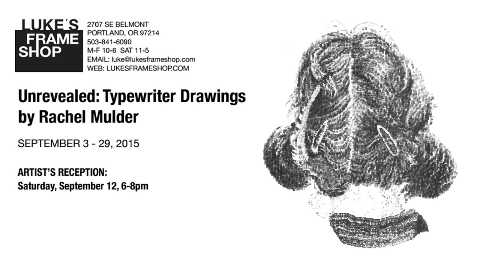
This collection will be on view at Luke's Frame Shop in Portland, Oregon this Septmber!


Saturday, August 22, 2015

In Progress - Patsy


detail, Patsy, 2015, typewriter drawing on Rives BFK

This is a portrait of an incredible woman I've known for several years.  She is beyond sweet, the queen of pet-names, brilliant, kind, and possesses a kind of wisdom I've never encountered before.  Her face is such a wonderful landscape to traverse with my typewriter.  Patsy is part of my series Unrevealed, which will be on view September 3 - 29 at Luke's Frame Shop (2707 SE Belmont, PDX, OR). 

Opening Reception for Unrevealed: Typewriter Drawings By Rachel Mulder
Saturday, September 12, 2015
6-8pm

I can't wait to hang this show--it is such an honor to show these works on paper at my favorite framing biz, Luke's Frame Shop. The opening also coincides with the Belmont Street Fair, so it should be a blast--but if you need a reprieve from the party outside, we'll be there to soothe you with wine and cheese.

Hope to see you there!


Tuesday, August 18, 2015

In Progress - Thom

I'm experimenting with a new way to deal with the narrow width allotted by my Sears Citation II typewriter. Looks like the beginning of a beautiful friendship, or future large-scale drawing nightmare disguised as friendship. Oh, good.

If you're in PDX, please come see the end result and celebrate the new incarnation of Unrevealed, my ongoing series of small-scale typewriter drawings, during the opening reception on Saturday, September 12, from 6-8pm at Luke's Frame Shop.  Can't wait!


Friday, August 14, 2015

Upcoming Exhibition: Unrevealed at Luke's Frame Shop


I'm thrilled to announce that my latest small-scale typewriter drawings will be on view at Luke's Frame Shop, my favorite local frame shop + art gallery from September 3 - September 29, 2015. I was fortunate enough to show the first incarnation of this series in my hometown, Milwaukee, Wisconsin, earlier this summer, and I'm very pleased I have the next twenty days to crank out some new drawings especially for this exhibition. Carpal tunnel, here I come.

Please mark your calendars for Saturday, September 12 and join me from 6-8pm during the opening reception, which delightfully coincides with the Belmont Street Fair. Hope to see you there!
Cyan, 2015
typewritten ink on paper, 8 x 10 1/4 inches
$200

Jamond, 2015
typewritten ink on paper
8 1/4 x 12 inches
$200
Michael, 2015
typewritten ink on paper
8 1/4 x 13 inches
 $200

Michelle, 2015
typewritten ink on paper, 8 x 10 3/8 inches
$200

Self Portrait, 2015
typewritten ink on paper, 7 1/4 x 12 inches
$200

About:

In this series of portraits the subject's identity is obscured either by natural visual distortion or by the purposeful withholding of certain features, a result of my fascination with the way in which facial features can mutate into erratic and confusing landscapes. As my heavy handed drawing techniques in traditional media and linework urge cartoonish renderings, the sense of veracity that comes with portraiture was elusive.


Using my Sears Citation II manual typewriter as a drawing tool and a photograph of the subject as a framework, I challenged my instinct to rely on caricature but also found myself resistant to the ideals of traditional portraiture. Rather than seeking and depicting a blank truth, where facial features and body parts appear as expected, I was compelled to complete an exercise in neglecting the firmly cemented visual images in my head. Navigating through this imagery using this cumbersome yet delicate drawing tool within the delineated contours of the photographs allowed me to scatter my focus, working in one compartment at a time and allowing the images to form like sediment collecting, a slow build of overlapping marks and feeds through the typewriter until each was complete. Focusing solely on the difference in values and angles and not the expectations of visual truth, I was led back to the fundamental task of drawing what’s there.